DO: This is a great window display promoting men's leather jackets. The store layered the exact same message three times in a single glance- front window graphics, the mannequin and the large poster behind. This achieves greater impact. Besides, it is always more effective to tell one story at a time.

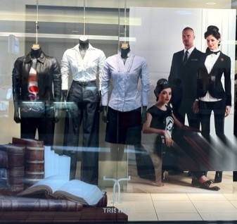
DON'T: The mannequins and graphics on the glass promote back to school clothing. However the large graphics behind the mannequins show a more format approach. --a woman in a tux and a man in a suit, mixed messages anyone?

 DON'T: leave inventory boxes around the shop, much less block the shop's main entrance.
 DON'T: Notice how the smallest items are displayed on the lowest shelf? This makes it not only difficult to view, but also hard to reach. One practically has to crouch down for a closer look. In this case, there is also too much of a negative space between the lowest shelf and the one above it, making the fixture overwhelm the actual display.
 DON'T: Cookware and slippers...enough said.
 DON'T: The mannequins and graphics on the glass promote back to school clothing. However the large graphics behind the mannequins show a more format approach. --a woman in a tux and a man in a suit, mixed messages anyone?