This week's entry is just a DON'T photo. I think it speaks for itself and need no further introduction. It simply violates to many guidelines- from hand written signs to spelling and most of all, in devaluing the very product being sold. Enough said!
Showing posts with label Sign Design. Show all posts
Showing posts with label Sign Design. Show all posts
Saturday, November 26, 2011
Do and Don't: If you can'ts spell it...
This week's entry is just a DON'T photo. I think it speaks for itself and need no further introduction. It simply violates to many guidelines- from hand written signs to spelling and most of all, in devaluing the very product being sold. Enough said!Saturday, October 1, 2011
Do and Don't: Handwritten, REALLY?!
DO: Regardless of how inconvenient it is to get a sign printed, it is vital that they have a professional finish. In this case, the brand and product values are conveyed to customers right before they enter the premises, starting the selling process. DON'T: While effort can be seen in creating this sign, and although the store has up to 50% off sale, this unprofessional look simply devalues the brand, the store and its products.
 DON'T: While effort can be seen in creating this sign, and although the store has up to 50% off sale, this unprofessional look simply devalues the brand, the store and its products.
Sunday, August 14, 2011
Do and Don't: What a Waste!
DO: Ensure that every opportunity to sell is taken advantaged of. In this case, not only is there an attractive price point sign, a monitor is added to engage customers. It provides not only product information but also emotional appeal to shoppers at the point of purchase. DON'T: What a waste of selling opportunity. Not only does an empty sign stand convey lack of attention to detail, it also becomes a shopping hazard! This is a lawsuit waiting to happen.
 DON'T: What a waste of selling opportunity. Not only does an empty sign stand convey lack of attention to detail, it also becomes a shopping hazard! This is a lawsuit waiting to happen.
Saturday, June 18, 2011
Do and Don't: Signs that Enhance Product Values
DO: Premium ladies' fashions requires signage that supports its image and identity. The Jones New York sign above shows how sign fabrication enhances perceived values of clothing displayed. DON'T: Really?! Orange with black and white, with super exciting background superbly fails to convey the clothing line's exclusivity and premium quality.
 DON'T: Really?! Orange with black and white, with super exciting background superbly fails to convey the clothing line's exclusivity and premium quality.
Sunday, May 8, 2011
Do and Don't: Window Message
DO: This is a great window display promoting men's leather jackets. The store layered the exact same message three times in a single glance- front window graphics, the mannequin and the large poster behind. This achieves greater impact. Besides, it is always more effective to tell one story at a time. DON'T: The mannequins and graphics on the glass promote back to school clothing. However the large graphics behind the mannequins show a more format approach. --a woman in a tux and a man in a suit, mixed messages anyone?
 DON'T: The mannequins and graphics on the glass promote back to school clothing. However the large graphics behind the mannequins show a more format approach. --a woman in a tux and a man in a suit, mixed messages anyone?
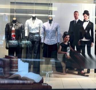
Saturday, April 30, 2011
Do and Don't: Deceiving Store Signs
DO: Customers interested in an item appreciate conversational signs. Not only do they provide key information, they also promote its sale. DON'T: This got me! I thought the yoga pants on display were only $10. I was disappointed and a little angry to find out that it is $10 off when one purchases the top and bottom set which costs $69.98.
 DON'T: This got me! I thought the yoga pants on display were only $10. I was disappointed and a little angry to find out that it is $10 off when one purchases the top and bottom set which costs $69.98.
Saturday, March 12, 2011
Do and Don't: Selling Signs-Is Handwritten OK?
DO: Mass market retailers like the one below, who want to promote the idea of extremely popular price points, use machine printed "handwritten" signs. This is the one instance where actual handwritten signs may also be acceptable although not as preferred as machine print. DON'T: Boutique owners selling mid to high price point goods should avoid handwritten signs. Besides looking unprofessional, printed signs always outsell handwritten ones! Product credibility, not to mention brand credibility is greatly diminished.
 DON'T: Boutique owners selling mid to high price point goods should avoid handwritten signs. Besides looking unprofessional, printed signs always outsell handwritten ones! Product credibility, not to mention brand credibility is greatly diminished.
Saturday, January 15, 2011
Do and Don't: Selling Signs-Location Determines Effectiveness
DO: When showcasing great prices to entice customers in, a listing of items within eye to waist level makes for an effective promotional sign. DON'T: Hanging a menu board sign with small text simply fails to catch customer interest. Besides, one needs binoculars to read the price listing.
 DON'T: Hanging a menu board sign with small text simply fails to catch customer interest. Besides, one needs binoculars to read the price listing.
Tuesday, November 9, 2010
Do and Don't: Sale Signs
DO: These sale signs maintain perceived product values. DON'T: On the other hand, these signs greatly devalue the merchandise.
 DON'T: On the other hand, these signs greatly devalue the merchandise.
Saturday, September 11, 2010
Do and Don't: Selling Signs
DO: Keep sign design consistent from storefront to back. DON'T: Mix poorly handwritten signs with printed ones. Keep them all professionally finished to ensure that perceived product values are not compromised.
 DON'T: Mix poorly handwritten signs with printed ones. Keep them all professionally finished to ensure that perceived product values are not compromised.
Subscribe to:
Comments (Atom)