DON'T: Really?! Orange with black and white, with super exciting background superbly fails to convey the clothing line's exclusivity and premium quality.
 DON'T: Really?! Orange with black and white, with super exciting background superbly fails to convey the clothing line's exclusivity and premium quality.
 DON'T: The lighting in the store below devalues the premium clothing merchandised. This type of lighting is often used for popular price point goods not unlike those seen in grocery or warehouse type stores.
 DON'T: Avoid boxing in a tight space. I was not sure who the shop owners think will jump over fixtures to shop this space.
 DON'T: leave inventory boxes around the shop, much less block the shop's main entrance.
 DON'T: Notice how the smallest items are displayed on the lowest shelf? This makes it not only difficult to view, but also hard to reach. One practically has to crouch down for a closer look. In this case, there is also too much of a negative space between the lowest shelf and the one above it, making the fixture overwhelm the actual display.
 DON'T: Cookware and slippers...enough said.
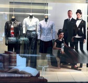
 DON'T: The mannequins and graphics on the glass promote back to school clothing. However the large graphics behind the mannequins show a more format approach. --a woman in a tux and a man in a suit, mixed messages anyone?