DON'T: leave inventory boxes around the shop, much less block the shop's main entrance.
 DON'T: leave inventory boxes around the shop, much less block the shop's main entrance.
 DON'T: Notice how the smallest items are displayed on the lowest shelf? This makes it not only difficult to view, but also hard to reach. One practically has to crouch down for a closer look. In this case, there is also too much of a negative space between the lowest shelf and the one above it, making the fixture overwhelm the actual display.
 DON'T: Cookware and slippers...enough said.
 DON'T: The mannequins and graphics on the glass promote back to school clothing. However the large graphics behind the mannequins show a more format approach. --a woman in a tux and a man in a suit, mixed messages anyone?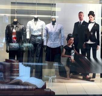
 DON'T: This got me! I thought the yoga pants on display were only $10. I was disappointed and a little angry to find out that it is $10 off when one purchases the top and bottom set which costs $69.98.
 DONT: Lighting for this unit can be effective when it is layered with other lighting sources. This display made the sides brighter but the midsection dark.
 DO: When in a narrow space, give customers a reason to visit the back section. In this case, the cash desk was moved to this challenged space getting people to visit this area. This move also enlarged the front selling space.