Saturday, November 26, 2011
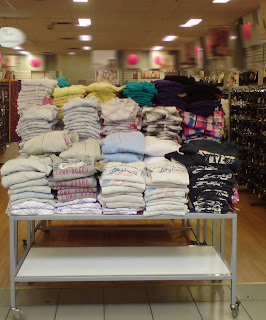
Do and Don't: If you can'ts spell it...
Saturday, November 19, 2011
Do and Don't: Show me the Light!
DO: Darkened areas can make a store look dramatic. In this case, eyes are drawn to feature highlights such as the focal display right at the centre and makes the power wall products visually pronounced. DON'T: A darkened area just because the lighting is inadequate or out of order is hardly the way to sell prestige cosmetics---Especially when customers are invited to test the products and see how it looks against their skin.
 DON'T: A darkened area just because the lighting is inadequate or out of order is hardly the way to sell prestige cosmetics---Especially when customers are invited to test the products and see how it looks against their skin.
Saturday, November 12, 2011
Do and Don't: Its a Trap!
Ever decide NOT to walk into a shop because it looks like there are no exit pathways? Funny how some retailers fail to realize that the more crowded a space is, the less likely customers will penetrate that selling space.
Customers do not want to feel trapped and unable to quickly exit any space.
DO: Front the storefront, customers can see that all areas of the store is readily accessible. The floor design itself makes the circular racetrack evident. DON'T: Avoid creating dead-ends like the shop below. I realize that at times, inventory levels are high, however it is still vital that customers are able to easily navigate the entire store.
Customers do not want to feel trapped and unable to quickly exit any space.
DO: Front the storefront, customers can see that all areas of the store is readily accessible. The floor design itself makes the circular racetrack evident.
 DON'T: Avoid creating dead-ends like the shop below. I realize that at times, inventory levels are high, however it is still vital that customers are able to easily navigate the entire store.
Labels:
Entryway,
Layout,
Retail,
Retail Design,
retail operations,
retail store,
Sales,
Selling,
Selling SPace,
Shop,
Shopping
Sunday, November 6, 2011
Do and Don't: Can't See!
GIVEN the choice, will customers still fully penetrate a selling space if they cannot view the shop or will they simply walk past it?
DO: A beautiful display setting that leads the eye from the front low table to the way to the back wall. Guess which direction customer traffic will go? They will surely visit each unit from the front to the back! DON'T: Too bad the front unit is loaded with too much merchandise that it hinders sightlines to the rest of the shop.
DO: A beautiful display setting that leads the eye from the front low table to the way to the back wall. Guess which direction customer traffic will go? They will surely visit each unit from the front to the back!
 DON'T: Too bad the front unit is loaded with too much merchandise that it hinders sightlines to the rest of the shop.
Subscribe to:
Posts (Atom)
