Saturday, February 11, 2012

Do and Don't: Am I Too Fat?

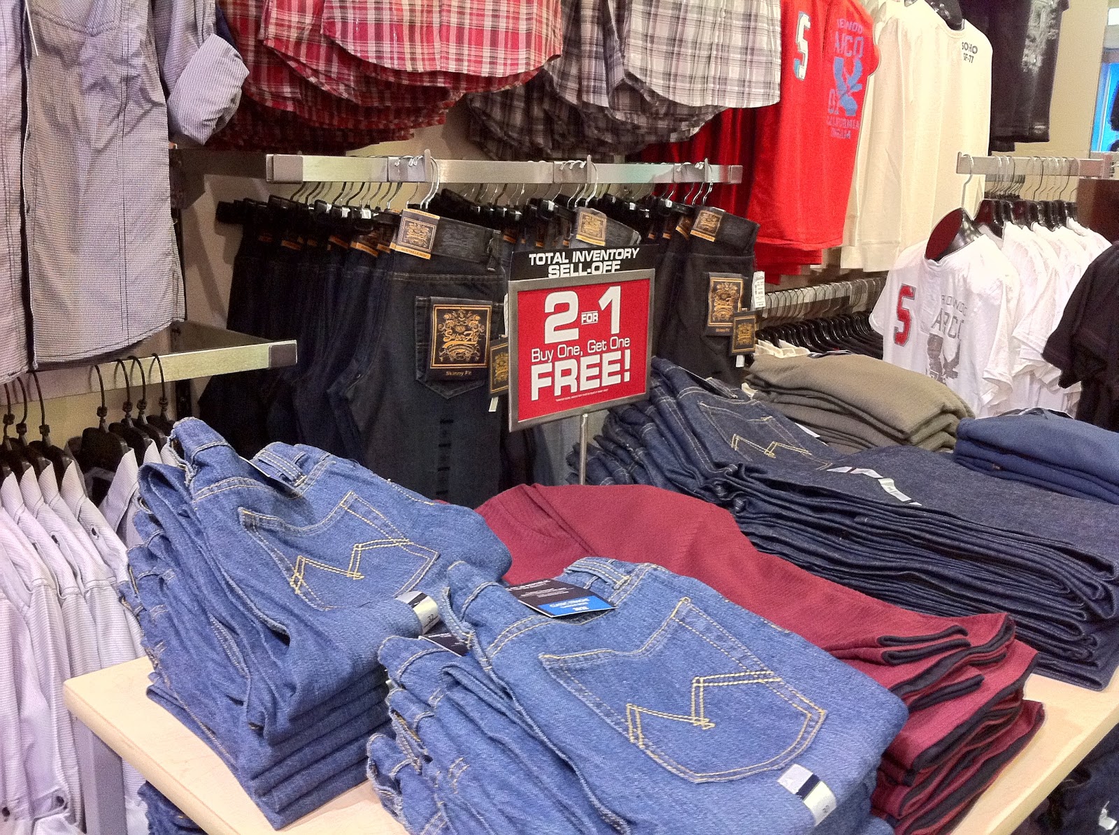
DO: Allow enough room for customers to browse through merchandise on the back wall. After all, there are more merchandise displayed here than on the front feature table. At least three feet of space between fixtures is good.

DON'T: I realize that space is at a premium, however who can ever fit in between this feature table and the wall to comfortably browse through the wall merchandise selection? I can't even imagine how anyone, skinny or otherwise, access this section.

Sunday, February 5, 2012

Do and Don't: When Backlighting Backfires

DO: Backlighting is a great strategy to attract customer attention and drive them to a specific area. However, additional lighting in front is needed to balance the bright back wall.
DON'T: See what I mean if the front is not lit and only the back is?  While this may marginally work for items such as eyeglasses/sunglasses, other merchandise displays fail when the product face becomes dark especially solid items such as the branding sign seen here.

Saturday, January 28, 2012

Do and Don't: Replenishment IS critical

DO: Full product intensity on the shelves convey messages of abundance and good business. To top it off, the chip salsas merchandised near eye level silently multiple sells.

DON'T: Uhh... would you really buy one of these chips? How old are they? Not only do they look uninviting, it also looks like the store doesn't have much to sell and business is in trouble. I realize when product turnover is high, replenishment becomes an issue. However I think this is going too far.

Saturday, January 21, 2012

Do and Don't: Hello? Anyone Home?!

DO: A warm and welcoming storefront converses to customers not only through signage but also its feature products.
DON'T: I was sitting outside this shop for well over half an hour and not a single soul seem to be working in this entrance section. What a wasted opportunity as many people passed by seeing this empty storefront. Avoid wasting any chance to sell!

Sunday, January 15, 2012

Do and Don't: Am I Really THIS Short?!

DO: I love how open display items are so reachable and invites customers' touch!
DON'T: Funny story here- I needed to buy the loofah sponge on the top of the column. The step ladder the shop provides couldn't even reach that height. And of course, there is no sales associate around to provide assistance. When I finally found one, I had to wait a full 8 minutes so they can wheel in a taller ladder. Why all the fuss? Why not just display vertically instead of horizontally so all items are reachable?!

Saturday, January 7, 2012

Do and Don't: For the Vertically Challenged

DO: I like how merchandise is displayed vertically from top to bottom rather from side to side. This introduces customers to new products as they scan left to right. Best of all, for vertically challenged people like me, I can access any product.

DON'T: Well, more in the 'category of could be better' than a real don't. Depending on customer height, the brown boxes will sell faster than the gold ones, which can only be reached when I tippy-toe.

Sunday, January 1, 2012

Do and Don't: Eye level displays SELL!

Two Shoe Warehouse shops: Which one will be easier to buy from? Well, better yet, which one can you see and touch (if you are normal height)?