Showing posts with label Store. Show all posts

Saturday, October 6, 2012

Do and Don't: Directing the Eye through Lighting


I love it when stores use lighting to create drama and attract the eye. Not only does it say that the products highlighted are special, they also lead the eye to the area the store wishes to promote. What a simple way to influence shopping behavior!

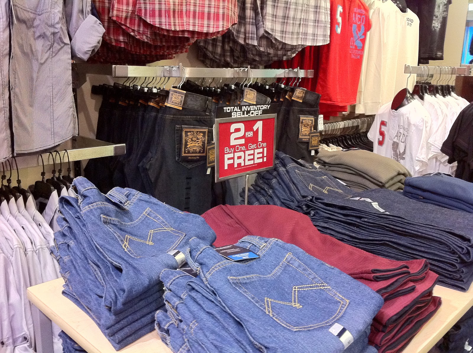
DO: Using different levels of lighting, this shop uses the brightest lights to bring the eye to a feature display.
 
CAN BE IMPROVED: Although the idea of a back lit is good as it attracts the eye to a specific location, it also darkens the very merchandise the shop wishes to promote.


Saturday, September 29, 2012

Do: Testers are Always Welcome


Ever been to stores that sell perfume wherein all the bottles are locked up in a glass cabinet? How do they expect customers to be attracted to the products when the displays are uninviting? 


The photo in this week’s blog shows one that caught my attention. All the products displayed below have a corresponding tester on the top shelf. The shelf height is a little below chest level and thus easily invites one to try the products. The absence of a sales associate in this case made the displays more welcoming as I knew I could play to my heart’s content without any interruption— and PLAY I did!


Saturday, September 22, 2012

Do and Don't: RMU Romancing the Customer


I often see the sad state of displays whenever I shop. I feel sad for the beautiful products that are just placed haphazardly as if the owner didn’t care. Even marked down pieces deserve a nice set-up.


DO: Retail Merchandising Unit Display (RMU)
The display is given structure and several design elements are utilized. There is direction, there is shape and there is an appeal to customers to interact with products. Items are also grouped by design.
 
COULD BE BETTER:
Nice ceramic bathroom accessories are just placed on a shelf without thought for design and display appeal.

Saturday, September 8, 2012

Do and Don't: Cubes? Who Knew?!

I mentioned in a previous blog that mannequin displays are appealing when they eye hits near the chest area. But what about kids mannequins? How can they be boosted higher closer to the eye so it hits the right spot?
DO: A great kids mannequin display! They are stacked atop cubes of varying heights giving the display an appealing and inviting look.

DON'T: Placing the kids bodyform on the floor is just too low. The customer has to probably bend down on their hands and knees to see the detail of the clothing being promoted.

Saturday, September 1, 2012

Do and Don't: The Right Fixture Makes The Difference

I am not sure what shopkeepers are expecting when they place teeny tiny items on the floor. Do they expect customers to kneel down and browse through them?!
DO: Products are neatly displayed on a nesting table. Display strategies implemented make this set-up appealing. I did one project wherein I exchanged gondola units to nesting tables and their sales went up 37% without changing inventory. Amazing what fixture can do to sales!

DON'T: When merchandise is stacked atop one another in a glass unit, there is hardly anywhere the eye can stop. There are advantages to a glass unit such as allowing the light through the displays, however the one pet peeve I have about these units is when it looks like products are just crammed in. Very unappealing, where's the romance?


Saturday, August 25, 2012

Do and Don't: $500 Sitting Atop a Box?!

Shocked I tell you, I am shocked to see a $500 item sitting atop an inventory box. Is retail space in such a premium that a shelf could not be spared? When I buy something that costs $500, I almost expect my heels to sink in some lush carperting with nice ambience surrounding me.

DO: The display informs customers of what price to expect to pay. In this case, mid price point is what I guessed these dinnerware to be and indeed, they are. Besides price, the display also gave me ideas on how to display them at home and the different items I can add to make my dinner table more appealing.

DON'T: $500 for this set? That's highway robbery! That is what most people will almost say when seeing this set sitting atop its carton box. Now if only it was displayed properly, I may find the $500 set a good value.

Sunday, August 19, 2012

Do and Don't: Cosmetics is STILL a Mini Luxury, Isn't It?

I subscribe to the belief that merchandise should be supported by the platform it is displayed on to ensure product values are uphelf and most of all, to make them appealing. Isn't that what retailing is all about? Making things begging to be bought?
DO: The right point of purchase display makes the difference between products sold right away and those that remain sitting in the shelf for a long time. Although this is an extremely popular price point, the display continually sells to the customer.

DON'T: I feel bad for the seller of these celebrity endorsed lipsticks. They do not deserve to be presented in a brown corrugated box. Infallible? I think not in this case.

Sunday, August 12, 2012

Do and Don't: Missing Bottoms

Mannequins exist to sell products. They are there to grab customer attention and invite them in for a closer inspection. As with anything in retail, attention to detail is crucial in grabbing the RIGHT attention.
DO: I appreciate how the mannequin is dressed and the clothing displayed on it can be immediately found merchandised behind it. Makes shopping a breeze!

DON'T: Where's the bottom of the front mannequin? This surely attracted attention, but the wrong kind. I noticed customers noticing it not for the clothing displayed, but rather for the lack of it. Imagine little boys laughing so hard.

Saturday, August 4, 2012

Do and Don't: Housekeeping is MAJOR

I understand how store can be busy and when delivery comes in, it adds to the chaos. However, is it acceptable at any one point to line boxes along an aisle, thereby blocking access to merchandise? Isn't that lost sales?
DO: Clean clear aisles are inviting and does not deter customers from coming in despite the line up at the cash desk.

DON'T: No room to store just delivered inventory? Maybe stacking them up closer to the back will minimize hindrances and allow more access to products being sold. Besides, these are trip hazards and the last thing retailers need is a lawsuit.

Saturday, July 28, 2012

Do and Don't: Amazons Viewing Windows

When displaying merchandise in a window, what is the ideal height? I always thought that its always best when the eye hits the chest area of the mannquins or close to the main feature of the clothing being promoted. Now the question is whose eyes? Someone who is 6 ft. tall or someone less than 5'5"?
DO: I like how the mannquins are just the right height, with my eye hitting the chest area. The lighting also hits this very area, hence drawing the eye to the spot. The strategy of repetition is successfully implemented and indeed makes an impact.

DON'T: I do like the repetition but my eyes hit near the knee area of the jeans. Viewed from afar, this height may be ok, however at that distance one cannot see the jean details. Besides the negative space below is too jarring isn't it?

Saturday, July 7, 2012

Do and Don't: A Window is NOT a Stockroom

It never ceases to amaze me when retailers fail to treat their shop windows with the respect it deserves. What a wasted opportunity– a chance to attract attention and sell the very merchandise on display. Too bad!


DO: With space at a premium the window is used as an introduction to what customers may expect inside the store. What an inviting display!

DON’T: This picture says it all– how the retailer simply must not care anymore. It does not matter whether one is a discount retailer or even a resell shop. Merchandise must be treated with dignity or else customers fail to appreciate its value.


Saturday, May 12, 2012

Do and Don't: Window NO NOs

When small stores need the window space to merchandise products for sale, one way to create this set-up is to group things by colour within a category to make it look like products belong in a single theme.

DO: With multiple items from different suppliers, this window still maintains its integrity simply by being grouped by colour. The large clear vases on the right most of the top table was filled with coloured water that matched the overall colour theme.

DON'T: Avoid displaying item together that have no relation to its use. For example, footwear with Canadiana souvenirs, or baseball caps with formal wear brooches together in one window.

Sunday, May 6, 2012

Do and Don't: The Perils of Live Mannequins

DO: This example of a window display using live mannequins show professional models working their best to create interest in the store and their products.

DON'T: This female model is indeed creating interest, just not in a positive way. I do feel bad for her, however she is supposed to promote merchandise, not show how tired she is.

Saturday, April 28, 2012

Do and Don't: When Signs Devalue Merchandise

DO: Not only is this sign's fabrication appropriate for the product being sold, the photo of the very merchandise "in use" makes it more appealing.

DON'T: So sad for there pretty jewelry pieces. They do not deserve to be treated this way, nor do they deserve the selling tags attached to them.

Sunday, April 22, 2012

Do and Don't: When An Empty Space is A Wasted Opportunity

DO: A great focal display informs customers not only of what to expect inside the shop, but also makes a statement on price and value.

DON'T: A wasted focal display space! The statement this area is trying to make is incomplete and draws the eye to the wide empty wall space.

Saturday, March 31, 2012

Do and Don't: When Replenishing Means Sales or NO Sales

Retail IS in the details. I wonder how many times I've stressed the importance of the simple things that could make or break a retailer's sales for the day. Replenishment is never romantic, nor is it something everyone looks forward to doing. However, replenishing inventory is key to sales. I wonder how many retailers are losing sales because they fail to do this very thing.
DO: I can understand that during the course of a busy day, keeping a full display can be challenging. However ensuring that shelves are filled conveys a positive impression, not only of product dominance but also of a healthy business.

DON'T: Last I checked these boxed chocolates were at full price. I was expecting that they be at least 50% off they way they are presented. Lack of attention to detail is detrimental to merchandise turnover and therefore business performance. Worse, not only was it a busy Saturday, this display is located in the main traffic aisle, in a major interesction or what is also referred to as strike zone.

Saturday, March 3, 2012

Do and Don't: IF You Have to Really Use Slatwalls

DO: Did I ever mention I like slatwalls the least? However I do understand retailers preferring them for their versatility. However I believe there are several other fixture options to attaining the same versatility without sacrificing the look. At any rate the photo above is a DO if ever slatwalls are used. Not only is it in wood veneer, it also uses metal slat inserts that reinforce the wall and at the same time lessen the impact of horizontal lines. Filling the wall with merchandise also make the repeated patterns of line less obvious.

DON'T: This wall is a no-no. The white slats make the repeated pattern of horizontal lines more pronounced and thus I feel that it catches the eye more so than the products. Here, the wall actually devalues the very products merchandised on it. What else can be improved aside from too much negative space? Pots and pans with framed pictures? What kind of an adjacency is that?

Saturday, February 18, 2012

Do and Don't: Worn and Torn

DO: Storefront or window signs are a great way to attract customer attention. Hence careful inspection of this for signs of wear and tear is a MUST. After all, this sets the customers' first impression of your store.

DON'T: Not only is this sign worn around the edges, there is a big hole right in the middle too!

Saturday, February 11, 2012

Do and Don't: Am I Too Fat?

DO: Allow enough room for customers to browse through merchandise on the back wall. After all, there are more merchandise displayed here than on the front feature table. At least three feet of space between fixtures is good.

DON'T: I realize that space is at a premium, however who can ever fit in between this feature table and the wall to comfortably browse through the wall merchandise selection? I can't even imagine how anyone, skinny or otherwise, access this section.

Saturday, January 28, 2012

Do and Don't: Replenishment IS critical

DO: Full product intensity on the shelves convey messages of abundance and good business. To top it off, the chip salsas merchandised near eye level silently multiple sells.

DON'T: Uhh... would you really buy one of these chips? How old are they? Not only do they look uninviting, it also looks like the store doesn't have much to sell and business is in trouble. I realize when product turnover is high, replenishment becomes an issue. However I think this is going too far.